Wednesday, 15 October 2008

Textual Analysis of Heat Magazine


This magazine is a popular magazine which focuses on information about celebrities and all the latest gossip. It is a magazine published in the U.K. and has been getting published since 1999. Other than information about celebrities it also contains information about movie and music reviews and TV listings.

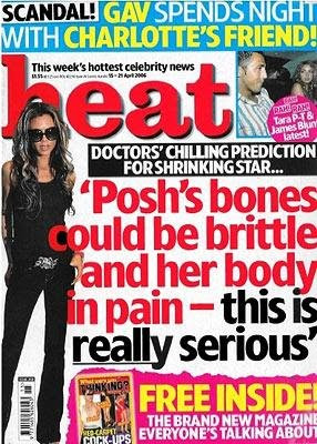
On this front page it has mainly focused on a story about Victoria Beckham and how she is "Ill" To advertise this story the have used huge bold red and black which is very attractive and draws the reader in. Also the text starts in red however, when it says "this is really serious" it changes to black to emphasise how serious it is, by doing this black it just shows in your face text and suit the actual words and meaning behind them.

The picture used of Victoria Beckham doesn't look like a professional shot it seems to be a photo what maybe the paparazzi has taken of her, while she poses, this could also be seen that the use of this photo backs up the text to show how serious the story really is. Also the picture of her stretches over the masthead "Heat", this showing that people have to come to recognise what heat magazine looks like and it's layout so when the magazine comes out in shops everybody instantly knows its heat so this allows pictures to be made bigger and be able to stretch over the word. The use of text size is very big and bold so it stands out to the public to draw them in to whats in this weeks issue, also they have stuck to just using for colours for the text red, black, yellow, and white as these all stand out on the backgrounds they are used on making them easy to read. As a smaller story alongside the Victoria Beckham story, there is another which says "Gav spends night with Charlotte's friend" and to back up the story it shows a little picture which paparazzi have taken. This story is just opened with those six words but this gives the reader a quick insight into the story making them want to read on and buy the magazine to read the rest of the "scandal". Also on the picture for this story it links to another story by a big circle saying "Tara P-T & James Blunt latest" so this shows another celebrity story giving the readers other gossip to read making it an even wider range of gossip which the readers can't resist not buying the magazine. Alongside the actual magazine is another "brand new" magazine and this is shown by showing a little picture of it and using a bit of text to show what it is, it says "free inside" in big bold letters this is so it emphasises it's free so it will make the readers want the magazine even more as they get another magazine free.

The language of this magazine is the structure of the layout and how they have sectioned each story of from each other. Also it's the use of all the pictures of the celebrities and the use of the masthead and headlines to back up the pictures.

The institution of this magazine is Bauer Consumer Media as they publish the magazine and incorporate all the information into the magazine about the celebrities.

The Ideology for this magazine is the stories on the celebrities so the idea's behind this text will have come from what the celebrities are getting up to.

The audience will be people aged between maybe 16-19 however, it could be older as it sometimes contains explicit images. Also the audience could be anyone who is interested in celebrity gossip.

The representation shown in the pictures are that they are paparazzi taken pictures, maybe with the celebrity posing or pictures which the celebrity doesn't want to be taken.

Tuesday, 14 October 2008

Textual Analysis of NME (Music Magazine)


This magazine is a magazine which is used to present information to the public about the happenings in the music industry. It has been published weekly since March 1952. It's purpose is to provide information about music such as: the music charts; tour dates; and general information about the latest happenings within music.

On the front of the magazine it shows the band "The Gossip" this is show as a huge photo of the band which focuses on the lead singer Beth Ditto as she is the bands main attraction. The pictures of her and her band mates look to be all single pictures of one another which have been put onto the magazine with Beth Ditto mainly taking up all the space with her picture on top of both the boys. The picture look professional and look to be a studio shot of each band member this could show that the band have had their photo's taking specifically for the magazine so the story which backs up the photo's will be authentic and true. The clothes they're all wearing looks to suit the music "scene" which relates back to the magazines specific aim of music. Due to the main vocalist Beth Ditto wearing black the white and red text used "The Gossip" and "Sex,Skins and standing in the way of control" really stand out and make it easy to read.

The title of the magazine "NME" (New Musical Express) is as red uppercase text on a black background which is used on every magazine showing consistency of that logo. As the magazine has come more popular the pictures used on the front cover have started to block out some of the NME logo this shows that due to the magazine popularity the people who buy it already know what the magazine is called so this allows the pictures to expand more over the text without any complication. Throughout all the text and sections on the front page of the magazine only four colours are used which are: red;yellow;white;and black these colour could be used because they easily stand out and draw the readers in. At the bottom of the magazine it shows the price and website address for the magazine, the use of the website address gives the reader another alternative on how to view information about the music industry. Down the left hand side of the front page, they're parts sectioned off which give an insight into a story which is in the magazine such as Noel: "I was wrong about the Klaxons" the use of this makes reader want to view the rest off the story when picking up the magazine. All the text which is used is all in a different colour making it more attractive.

The language used on this front page of the magazine is how the layout is structured with several sections of text and how it's all been parted from one another, the picture of the band "The Gossip" and the masthead and headlines.

The institution of the magazine is IPC Media who publish the magazine and also NME who produce all the information from the music industry and put it into their magazine.

The ideology for the magazine is that it's all about music so the idea's behind the text what is in the magazine will have come from the latest happenings in the music industry.

The audience for this magazine could be seen for an age of 16-19 however, it's mainly for anyone who is interested in musuic.

The representation shown in the pictures are that they're all part of a band with them being taken as professional photographs.

Thursday, 9 October 2008

Textual Analysis of "Secondary Teachers Magazine"


This is a magazine which is aimed at teachers of secondary school. It's purpose is to give out information about teaching and secondary school in general. The main front cover of the magazine in the boy sitting in class whilst the picture of the girl is what is show on the back of the magazine but when opened fully they follow on from one another.
On the front page it shows a boy in full uniform who looks between the age of 14-16. He is looking to answer a question which shows his eagerness to succeed however this is quite misleading because a lot of secondary school students don't share the same eagerness he does. The uniform he is wearing shows his smartness and loyalty towards his school. This is also the same as the girls picture as they both look the same age and are both in the same uniform. When looking at both pictures when the magazine is fully opened, it looks like the girl is looking at the boy putting his hand up which shows she is interested in what the boy has to say. However, the pictures don't really look like they have been taken in a class, they look very professional due to the fact it's just a white background with there bodies pulling a pose.
The setting of both the pages are exactly the same apart from the "plus free student cook books" part is in a different place from one another along with the " Do boys and girls learn differently" which is also in a different position. Other than that the page layout is the same with both picture being positioned centrally to show the reader the meaning behind the magazine, to show it's about student learning at secondary schools. The words "Secondary Teachers" has the boys hand covering part of Secondary this could be due to that because they have had several issues of the magazine out, many people will know the name already so they are able to expand a picture over the text. There is a little amount of text used on both pages however, the text is the same on both back and front pages. But the text saying "Do boys and girls learn differently" is pink on the girl page and blue on the boys page which could be seen as sexist by saying only girls like pink and vice versa however, this could be just a mix of two colours as the word "plus" is used in pink on the boys and blue on the girls which could maybe be seen as fighting sexism by showing boys could like pink and girls like blue. The three sections at the top with bits of text are you on the front and back which show consistency and are there to give a quick insight into some information which can be seen in the magazine. Also the bottom of the pages states their website and the date the magazine came out which is used on the front and back of the magazine again, this could be always there so that people who often read this magazine will always know where to find the website and the issue date.
The language used in this piece of media text, is the whole layout structure, the pictures of the boy and girl, the masthead of "Secondary Teachers", the headlines "Do boys and girls learn differently" and all the text used throughout the pages.
The institution of the magazine is teachernet who produce the magazine and give information for the teachers.
The ideology is the ideas behind the text and in this case it is the information about secondary schools and the way it's presented in the magazine, with all different information.
The audience is for the teachers of any secondary school who will be consuming the text and also could be anyone associated with the secondary school.
The representation on the magazine is the people used for the pictures and the objects in the picture such as the books and pens, and shows the kids on the front as happy and eager to learn.

Tuesday, 7 October 2008

Foundation Portfolio - Preliminary Task

Key Concepts.
My preliminary task in AS Media studies is to produce a college magazine, for the magazine i have to produce a front cover and contents page. When making this magazine i shall follow the acronym LIIAR.

Language - Technical and theoretical terms. Suggests specific terminology. This will be everything included in the magazine such as: the layout;photographs;masthead;headlines;and text.

Institution - This is the production of a media text. So when producing the magazine for Wyke college, Wyke will become the institution. This will provide information about Wyke to people who don't know what it is.

Ideology - This is a shared system of beliefs and values and will be represented in the context.

Audience - This is the consumers of the media text. This could be aimed at any age group, or any type of audience such as a large or small audience. For the magazine the audience will be aimed at Wyke students or anybody who is associated with Wyke, or lives near Wyke's location.

Representation - This refers to the construction of any media text of aspects of reality, such as: people;places;objects;or events.